
Guys... GUYS. Where do I start? It's no secret Urban Decay are one of my favourite brands, and I always look forward to seeing what they come out with for the holla'dazeee (Book of Shadows, Vice Palettes etc.) and this year was no different. I already own Vice 1 and 3, with the latter being my favourite of all the palettes they'd released... until now. I didn't think they could top the stunning jewel tone and burgundies in Vice 3 but I was wrong. Let's just say I'm VERY excited about Vice 4 and I think a lot of you guys will be too. I will say overall this is not a neutral only wearers palette, if that's more your thing then I'd look to the Naked Palettes (with their latest offering being Naked Smoky) but if you like a bit of colour to mix in with your neutrals, like some glittery jewel tones, duochromes (hurray!) and overall colour then this will make a beautiful palette for Christmas time.
Starting off with the packaging - it's absolutely stunning. You don't have to be a makeup lover to appreciate that a lot of thought and effort went into this design which mimics an oil slick and looks almost holographic, shifting colour as you move the palette in different lights. I love the layered detail and shattered glass effect, it's just overall super aesthetically pleasing. It also comes with a little pouch to keep the palette/makeup bits in which and a synthetic duo-ended brush which are nice additions... but it's what's inside that counts, right?


In classic Vice style the palette contains 20 shadows (this year's are all new, never-before-seen) in an organised grid system. You have a small number of light neutrals, a lot of fun brights, and plenty of sparkle jewel tones which I think look particularly gorgeous this time of year. In terms of textures, you don't have a lot of mattes (3, maaaaybe 4) but it doesn't actually bother me that much because the mattes that they do have are gorgeous and the other shades for the most part are buttery AF it's insane. They have shimmers and satins, chunky glittery shades (which I'll get into in a second) and most excitingly: duochromes. These are stunning and are exactly what I wanted Makeup Geek duochrome shadows to be like. Can you tell I'm excited?

Bones is described as an "oyster satin with pearl" and I think that's the only way to sum it up. It's a very subtle shade, but would make a beautiful all over lid colour (particularly on a more mature lid but I mean anyone would rock this really). It reminds me of Vex by MAC with the light grey base and pink/gold pearl sheen. Stunningggg.
Framed is a peachy light neutral and would make a great matte highlight for a darker skin tone. Unfortunately there are no highlights quite light enough for my skin tone in this palette but that doesn't bother me at all; I never see Vice palettes as "complete" palettes. I always have to pull one or two shades from my collection elsewhere but again, the shades in these palettes are so lovely that it doesn't bother me at all; I have tonnes of matte browbone highlights. It still makes a good subtle blending colour for paler skins, though.
Discreet is a soft grey mauve matte and works great as a transition shade for any purple or grey smokey eye.
Bitter is the most amazing mid-tone brick red brown with a slight orange hint. I know a lot of people are comparing this to UD's Riff eyeshadow but Bittersweet is much warmer, more red and in my opinion more unique and just ahhhh I want to wear this all over my eyes all day every day. The texture was A1 on this too!
 |
| L-R: Bones, Framed, Discreet, Bitter. |
Grip is a taupe with floating gold pearl. My swatch of this isn't anything special because honestly this is a dud shade in the palette. Thankfully there are only 2 crappy shades out of 20 but yeah, this is one of them. You could use this as a very subtle crease shade or blending colour, but I wouldn't really bother because it was just bleh. Dry and hard to build, it just disappeared as you swatched it on the skin.
Fast-Ball and the rest of this row redeems the anti-climatic Grip because holy god this shade is close to a religious experience. It's somewhere in between a red and pink with a pink, purple and peach duochrome. There has been nothing but grey skies about the last 2 days which made this shade a pain to photograph but holy baby jeeeeebus it is beautiful and I can imagine this looking insane over a black base.
Grasshopper is a high metallic emerald with gold glitter. Thankfully it isn't super chunky glitter and this just feels like butter; ALL of the brights/purples and just generally metallic shades feel almost cream like as you touch them it is so so goooood. CAN YOU TELL I AM EXCITED. At first glance I thought it looked similar to Vice 3's Dragon but after swatching them side by side Grasshopper is just better in vibrancy and pigmentation. UD steppin' up the game.
Flame is a bright orange and a peach duochrome and gold micro glitter. This is a chunky shade, but it is absolutely beautiful and worth all of the effort and dusting off and sticky bases because look at it... LOOK AT IT. It's so hard to capture duochromes in a photo but if that's how it looks in a still frame you can only imagine how multi-dimensional and "oooh.. ahhhh" it is when you're moving your hand/blinking in different lights. To quote my good friend Ray: "I would spend 50 euro on that eyeshadow alone"
 |
| L-R: Grip, Fast-Ball, Grasshopper, Flame. |
Deadbeat is a satin black with very, very subtle blue and silver shimmer. Not the most exciting shade but a good one to have and the pigmentation is brilliant in this one too!
1985 is a metallic fuchsia with a slight violet duochrome. Buttah buttah buttaaaaah.
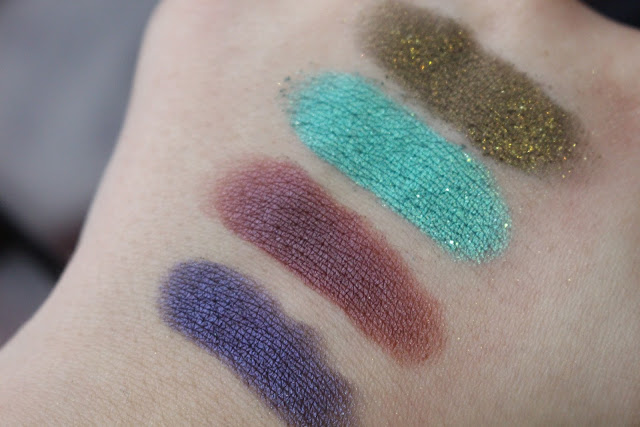
C-Note is a really interesting shade and the only thing I can compare it to is a dollar bill? It is a frosted seafoam green that falls somewhere between silver and teal. Super creamy and pigmented, but of course you already knew that.
Low was the only other disappointing shade to me so I suppose the name is pretty appropriate. It's described as a matte brown with iridescent micro-glitter. Low looks quite interesting in the pan, but so vanilla and boring when it's swatched. The texture was quite dry and the glitter just looks silver when applied. Meh.
 |
| L-R: Deadbeat, 1985, C-Note, Low. |
Another "hubba hubba how you doin'?" row of all kinds of pretty. Beatdown (Hello, Willam Belli) is a deep yet still vibrant violet purple with a blue duochrome. This is like the old UD Ransom shade but on speed. Another shade that I want to wear all over my eyes all day every day.
Underhand is a deep red plum eggplant with a metallic sheen. Stun hun xo
Arctic is a bright turquoise with silver microglitter. Again, not chunky glitter and it will probably just look super metallic on the lid. Not the most unique shade in the world but still opaque and creamy.
Crowbar is an interesting colour. It's a blackened olive green with tonnes of gold and green glitter and reminds me a bit of Makeup Geek's Utopia pigment. Make no mistake, this shade is chunky and is one that works best over a sticky black base, patted all over the lid with your finger but if you choose to wear it like that I think you might just love it. I think this would make for a beautiful sophisticated (ie. work party appropriate) night out smokey eye for Christmas, paired with Bitter as a transition shade. YAAAAAS.
 |
| L-R: Beatdown, Underhand, Arctic, Crowbar. |
The final row contains 4 shades that would make a beautiful cool toned purple eye for both day and night looks. Pandemonium is another deep eggplant shade but has a much cooler undertone than Underhand. It has slight glitter but I found that this just fell as soon as it was applied, which doesn't actually bother me cause the actual colour is stunning sans glitter.
Harlot is a light metallic lavender. No glitter, just pure smooth buttery colour.
Robbery is a shade that could go with both neutral brown/silver looks or would equally look gorgeous paired with purples. It has a bit of a Satin Taupe feel about it with a taupe base and purple undertones.
Delete completes the Vice 4 as a deep, warm chestnut brown. It's super pigmented and blendable with a demi-matte finish. I say demi matte cause there is very, very slight shimmer that doesn't really appear on the skin but really just aids blending which I'm 100% okay with.
 |
| L-R: Pandemonium, Harlot, Robbery, Delete. |
This palette retails for €48 from Debenhams stores/online and House of Fraser, Dundrum. I'm always a fan of the Vice palettes cause I think you get a tonne of interesting and beautiful shades for a really good price point. If you only wear neutrals I would say maybe skip this and wait for the Gwen palette, but I really think these are some of the most unique shades that UD have brought out collectively in a palette in a long time, and I think overall the quality is far superior to say the original Vice palette. Vice 4 is limited edition for the holidays and I know they always make a popular gift for Christmas time so if you're interested it's probably worth snatching it up when it launches October 28th. Similarly, if you're on the fence about this and have regretted not going any of the previous Vice palettes, I would say pick this up and I don't think you'll regret it! I'm having so much fun creating looks using this already and can't wait to keep wearing it and combining different colours :)
Bitter Flame:
Prepped the lid with Urban Decay's Anti Ageing Primer Potion and used Framed as a transition shade. Bitter buffed all across the crease and inner/outer corners of the lid, leaving the centre bare. I buffed Bitter along the bottom lid and smudged a bit of Delete into the lower lashline and close to the inner/outer third of the upper lid so there was a smooth transition from dark brown to orange. I patted Flame in the centre of the lid, and Fast-Ball in the inner corner for some duochrome goodness!

1985 Beatdown:
Primed with UD Primer Potion once again and used Discreet as a transition colour. I mixed Deadbeat and Beatdown into the crease (with a little more purple than black). I used a flat brush to pack a small bit of underhand on the outer corner of the lid, and used the other side of the brush to sweep 1985 across the rest of the lid, blending the two lid shades as I went along. I buffed Beatdown along the lower lashline and added a touch of Harlot in the inner corner - the inner corner highlight is super subtle because I added it after the liner but if you're not doing a tear duct liner style then a bright lavender inner corner would look beautiful!

Arctic:
UD Primer Potion, Framed as a transition shade and a mix of Bitter and Delete in the crease. I applied Bones all over the lid for a super easy neutral look and added winged liner. This would make a great every-day pin up style makeup but I was in love with some of the blue/green shades in this palette so I wanted to find a way to incorporate them just a little, making it more of a fun peek of colour. I used Chaos pencil (Urban Decay) in the waterline and buffed Arctic all across the lower lashline and inner tearduct.

Bitter Flame:
Prepped the lid with Urban Decay's Anti Ageing Primer Potion and used Framed as a transition shade. Bitter buffed all across the crease and inner/outer corners of the lid, leaving the centre bare. I buffed Bitter along the bottom lid and smudged a bit of Delete into the lower lashline and close to the inner/outer third of the upper lid so there was a smooth transition from dark brown to orange. I patted Flame in the centre of the lid, and Fast-Ball in the inner corner for some duochrome goodness!

Primed with UD Primer Potion once again and used Discreet as a transition colour. I mixed Deadbeat and Beatdown into the crease (with a little more purple than black). I used a flat brush to pack a small bit of underhand on the outer corner of the lid, and used the other side of the brush to sweep 1985 across the rest of the lid, blending the two lid shades as I went along. I buffed Beatdown along the lower lashline and added a touch of Harlot in the inner corner - the inner corner highlight is super subtle because I added it after the liner but if you're not doing a tear duct liner style then a bright lavender inner corner would look beautiful!

UD Primer Potion, Framed as a transition shade and a mix of Bitter and Delete in the crease. I applied Bones all over the lid for a super easy neutral look and added winged liner. This would make a great every-day pin up style makeup but I was in love with some of the blue/green shades in this palette so I wanted to find a way to incorporate them just a little, making it more of a fun peek of colour. I used Chaos pencil (Urban Decay) in the waterline and buffed Arctic all across the lower lashline and inner tearduct.

No comments :
Post a Comment